
01- Problem
Pregnancy is equal to Maternity, almost all of the information available for couples expecting are targeting and talking directly to the female gender and most men are obliged to use female oriented apps to follow their partners’ pregnancy.
Even though the father/non-pregnant partner can understand what is going on with the baby’s development, it is hard sometimes for them to connect and truly help their partner.
Even though the father/non-pregnant partner can understand what is going on with the baby’s development, it is hard sometimes for them to connect and truly help their partner.
02 - Research
From the user research I conducted, most people feel like the information available online is too unreliable, that it can be intimidating, and both men and women feel like there isn’t much information targeted to and from the point of view of the non-pregnant partner.
Most pregnant women felt that their partners were a great help not only around the house but a psychological support as well. And even though fathers wanted to know how the baby was developing, they were far more interested in how the woman is changing and what she is feeling during these 9 months.
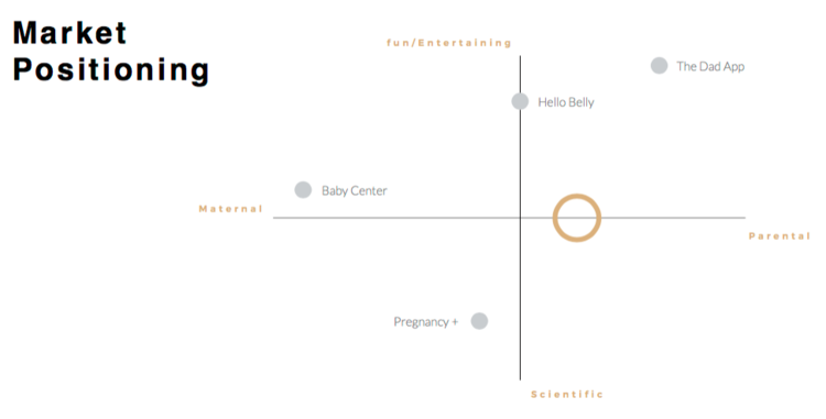
I conducted a Market Research and Competitors Analysis to see where the app is going to be positioned in the market.
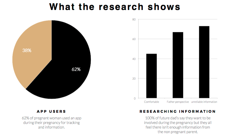
Information collected from online forms and one on one interviews
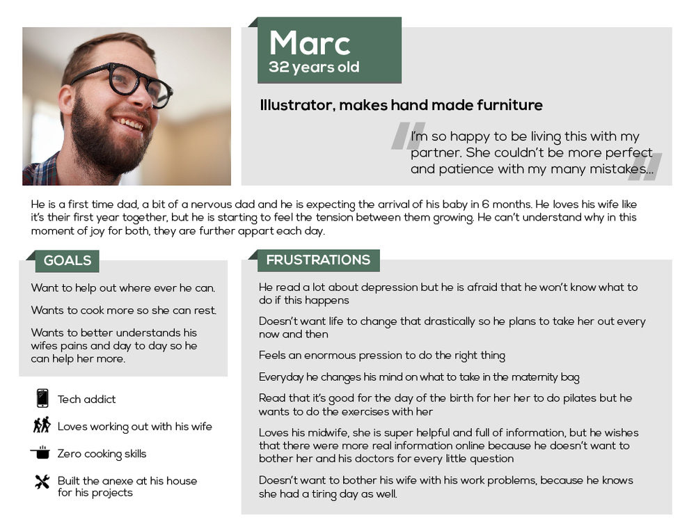
PERSONA
User Personas are fictional characters assembled from the behaviours and motivations of the many actual users we encounter in our research. They personify everyone we encountered but they are most definitely not caricatures or stereotypes of our users.
So this is how we get to Marc, my user persona. A 32 yo first time dad, illustrator that makes hand made furniture on his spare time and that embodies the most important and most recurrent wins and pain points of all the people that I talked to.
03 - Solution
Each user will have their one specific needs for the app. But in order to create an MVP I needed to prioritise and design with my persona’s needs in mind. To do that I created User Stories (Creating User stories early in the design process, lets them dictate the design decisions, rather than our preconceived ideas of how the product should be or should look do it) that were after prioritised with the Moscow method.
So the app will be anchored under these 3 pillars:
- The app will be an app that focus on the baby but not exclusively. It would have information on the mom, her physical and mental condition alerting the other partner when these problems might appear.- The app will ideally have the backing from the Conseil des Sages-Femmes and/or European Midwife Association.
- It should give fun and amusing content for first time parents that can help them relax during these stressful months.
Next version of the app (after testing and further research) will have a feature to resolve a big pain point mentioned by the interviewed couples: create a calendar for future appointments and a place to storage the baby’s medical information.
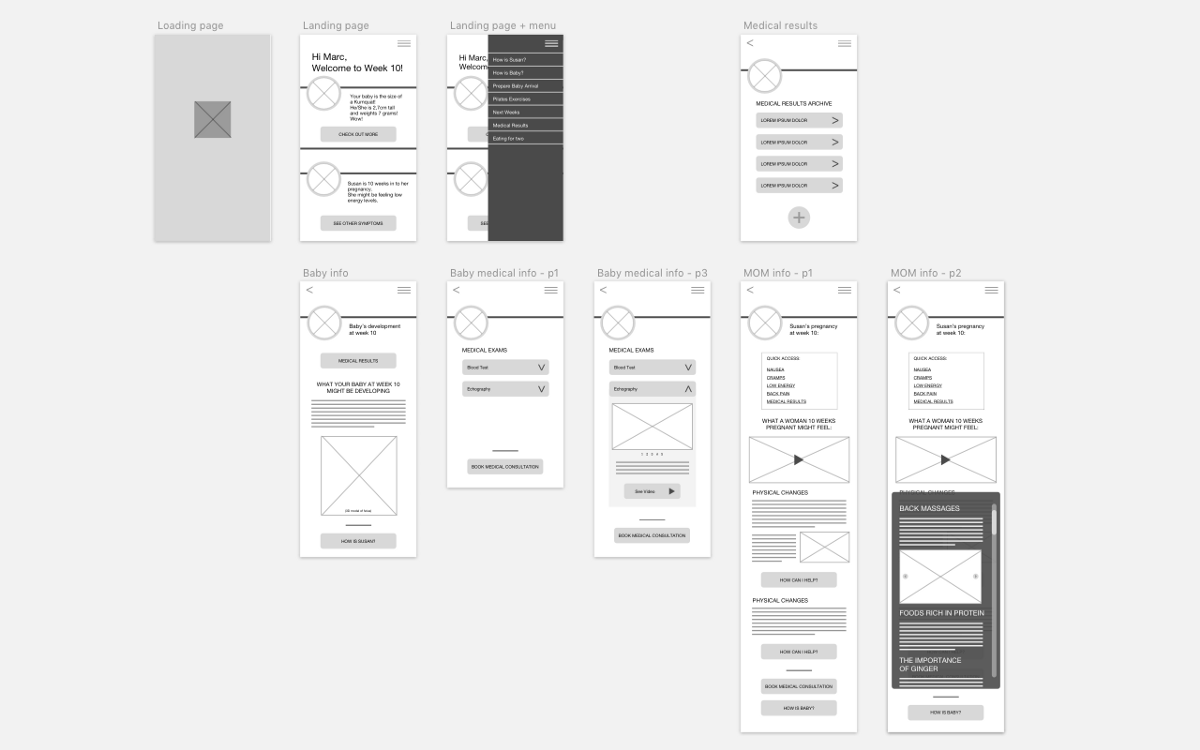
PAPER PROTOTYPES AND TESTING
Before working on the final High Fidelity Design, Low Fi and Mi Fi prototypes should be created to test our concept and feature choices. Here we take into consideration our future users feedback in how they physically interact with the solution created.

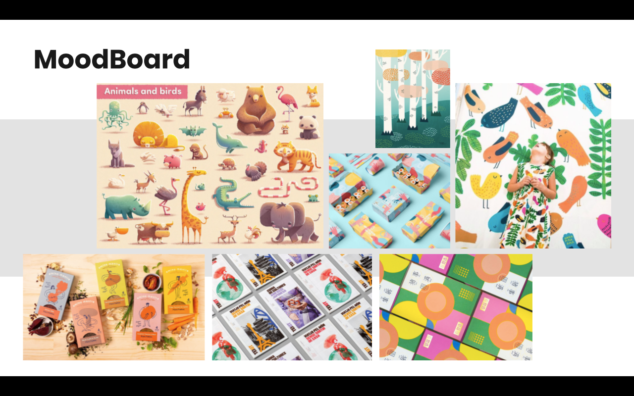
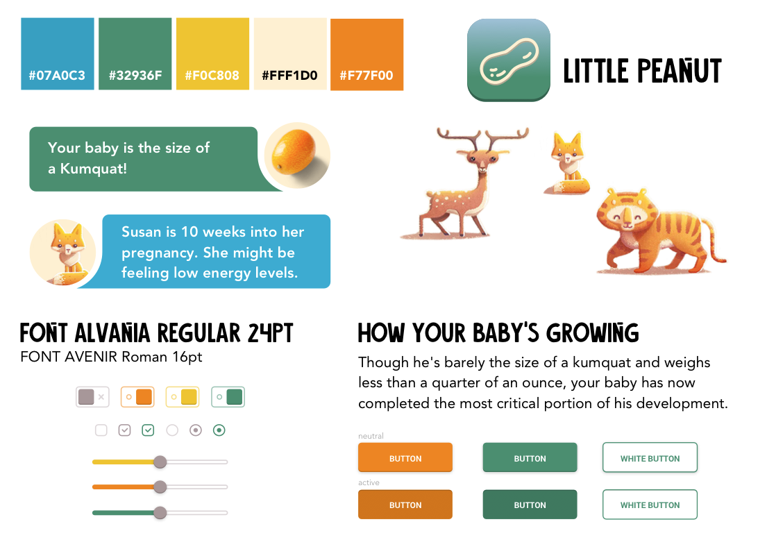
MOODBOARD AND STYLE TILE
Even though this app is about babies and amusing facts, it is still full of important and reliable information, hence the choice in this illustration style and these specific fonts.
With the style tile and moodboard defined, there is nothing left but to start building our High Fidelity Prototype — the most faithful reproduction of the final product.
This will be the most accurate picture of what an app/website will look like after it’s developed and launched.
