Festa Cinema Francês

In 2014, the French Film Festival (Festa do Cinema Francês) celebrated its 15th edition, with the desire to break the stereotypes that French cinema had with Portuguese audiences.

In 2014, the French Film Festival (Festa do Cinema Francês) celebrated its 15th edition, with the desire to break the stereotypes that French cinema had with Portuguese audiences.

About the project

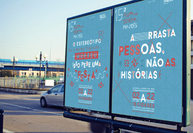
The team at Publicis Lisbon was tasked with creating a new visual identity and an ATL campaign for the festival that would capture the attention of a different side of French cinema and a wider public to the theaters.

Date:

2014

Services:

Concept &
Art Direction

Concept & Art Direction

O Último Mestre das Pausas

The Last Great Master of Pauses

CCP (Clube Criativos de Portugal)
-
Bronze Award in Best Film Digital
- Bronze Award in Best Film for Campaign

Project insight

French cinema, although incredibly diverse, has always been seen as “too intellectual” and “too slow” for Portuguese audiences. The concept behind this campaign is based on the stereotype that French cinema is slow because someone is in charge of making the films slower. 

This is how the Master of Pauses was born, from an old-fashioned stereotype that needs debunking in order to welcome more audiences eager to rediscover new directors and stories.

Visually, we wanted the Festival’s identity to connect to French culture and be immediately recognised, so the team created a typography based on the Eiffel Tower's intricate shapes, giving us a unique layout not only for text but also icons and illustrations that were used in multiple supports throughout the campaign.

Visually, we wanted the Festival’s identity to connect to French culture and be immediately recognised, so the team created a typography based on the Eiffel Tower's intricate shapes, giving us a unique layout not only for text but also icons and illustrations that were used in multiple supports throughout the campaign.

O último Mestre das Pausas, baseado em estereótipos reais
Demora a acreditar mas o Cinema Francês está diferente

The last Great Master of Pauses, based on real stereotypes
It took its time, but French Cinema is changing

© Ana Costa

Paris

© Ana Costa

Paris